

Dom Pérignon x Taylor Swift
Brand Identity, Packaging, Copywriting, Brand Film
The collaboration between Dom Pérignon and Taylor Swift combines creativity and luxury in a way that has never been seen before. Together, Dom Pérignon and Taylor Swift acknowledge love, heartbreak, and all of life’s turmoil that can be deemed as a champagne problem.
Key Research Takeaways
-
Dom Pérignon is a “vintage only” wine brand that strives to make only the best wine. The brand is in a perpetual quest for harmony as a source of emotion. The creative legacy is essential to Dom Pérignon, so finding a collaboration that aligns with these values is crucial.
-
In Dom Pérignon’s past collaborations, luxury is essential, and the visuals always look like the perfect mesh between artists and the brand.
-
There is a slew of celebrity-made alcohol, and collaborations, but none focus on building a community to further the brand or their message.
Dom Pérignon x Taylor Swift
|
Brand
|
Merchandise
|
Advertising
Concept
Referencing one of Taylor Swift’s hit songs, “champagne problems” from the album evermore, Dom Pérignon will communicate the idea of unity through struggle and build a community where people can connect on all of life’s champagne problems.
Design Principles
-
Combine the heritage of Dom Pérignon and the simplicity of modern design
-
Remain true to Dom Pérignon’s brand
-
Showcase luxury in a new way that showcases the collaborators visually
Brand Building
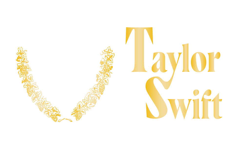
The brand is built with the use of Dom Pérignon ligatures, and Taylor Swift’s most recent brand style, hairline serifs. The single ligature present in “Taylor Swift” reflects the curvature of the Dom Pérignon shield while also mirroring the shape of the font. The presence of the gold outline adds a layer of luxury and completes the design composition in a simple, yet effective way.
The Outer Packaging


The Label


Brand Elements
The brand elements feature a black and gold color palette paired with a hairline serif. The addition of the gold outline on the label and booklet help further the design composition in a way that is simple, yet luxurious, furthering the brand and its values.


The Booklet


The Video

Luxury. Community. Collaboration.
The brand features a simple layout with a high contrast color palette that allows for the visual style to stand out amongst competitors. The designs remain luxurious while also visually connecting Dom Pérignon and Taylor Swift in a way that stays true to the brand.

The Launch Strategy
Mission Statement
A collaboration designed for people who are experiencing all life has to offer and realizing that sometimes it doesn’t always go according to plan.