Retrota
Brand Identity, Web Design, Copywriting, Illustration
A hobby website for new record collectors that features cleaning and care tips, as well as recommendations. The website is meant to foster a welcoming, fun, and safe environment for new collectors where they can be free to ask whatever questions they may need answered.
Retrota
|
Brand
|
Illustration
|
Website
Concept
Based on ‘50s and retro styled illustrations and typography, Retrota will utilize fun graphics to make a more modern and welcoming experience for new vinyl record collectors to learn more about the hobby.
Design Principles
-
Use bright colors in attention-grabbing ways, but find a balance between the colors
-
Be clean and minimal, but also allow for movement across site pages
-
Reference ‘50s stylizations, but use modern design techniques
Brand Building
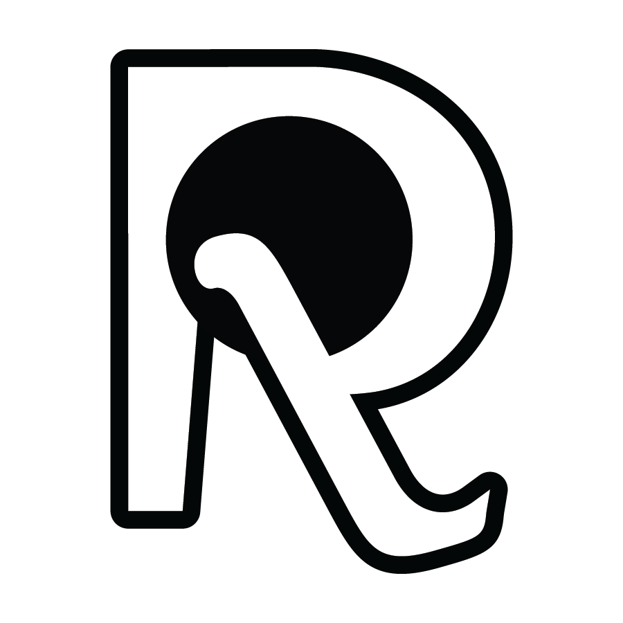
The brand is built with the use of a retro font that still allows for movement across the page and remains legible on a small scale. The “R” creates an active turntable, giving consumers an understanding of what Retrota is about. There are four main color ways for the logo and icon, all with different use cases. The most common is white on purple, which is visible on the site. The “R”, as a standalone icon, is used as the favicon and should only be used in place of the primary logo. The wordmark is considered the primary logo, and the secondary logo is the icon.


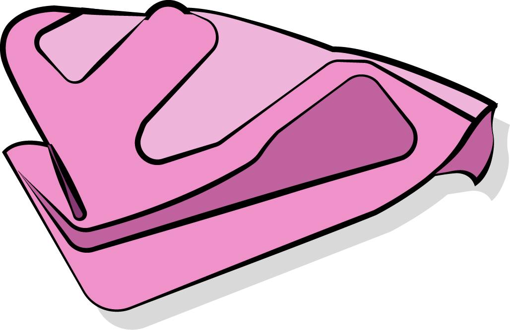
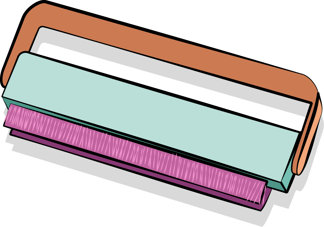
The Illustrations


The Final Site


Brand Elements
The brand elements feature two types of color palettes, one for the brand and one for illustrations. These color palettes are paired with a non-traditional sans serif for headers and a base sans serif for body copy. The addition of illustrations helps further the compositions of each page while giving further information to users.


Fun. Retro. Bright
The brand and website feature simple layouts with a fun color palette that allows for the visual style and tone to stand out amongst competitors and be welcoming for users. The designs are retro while also bringing modern design to the pages in a way that feels natural and true to the brand.
Mission Statement
A website designed to be easy to navigate, welcoming, and fun to encourage new users and collectors to explore and build a community where they feel safe to ask any question without fear of being mocked.