

Leviathan Vodka
Brand Identity, Packaging, Point-of-Purchase Display
Leviathan Vodka comes from the idea that drinking is a sin, but people still indulge in it. With the addition of the illustration, the labels and branding showcase elements of Gothic architecture. Each bottle of vodka is associated with a different demon to personify the different flavors Astraroth Apple, Belzebuth Berry, and Belial Banana.
Leviathan
|
Brand
|
Merchandise
|
Advertising
Brand Building
The brand is built on Gothic architecture. The intertwining of the circles and details of the silhouettes reflect common visuals from the Gothic period which influenced the rest of the brand.


The Label
The Point-of-Purchase Display


Brand Elements
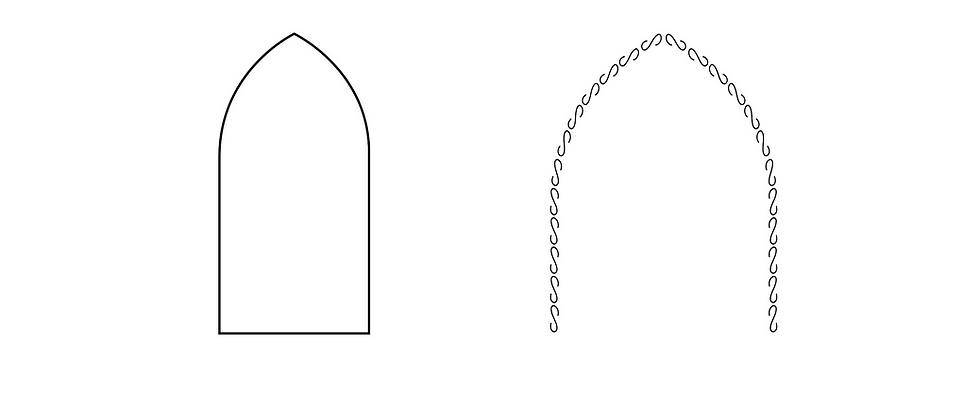
The brand elements feature a black and white brand with pops of color for each flavor of vodka. A more historic-looking typeface brings a Gothic look to the brand and supports the brand visuals. The addition of the arches and black and white sketchy illustration style further emphasizes the Gothic themes and visuals.

Gothic. Interesting. Compelling.
The brand features a simple layout that allows for the visual style to stand out amongst competitors, which catches the interest of consumers. The labels remain clean while also giving into the structure of gothic architecture, which plays into the story of the brand.
Mission Statement
To give people the opportunity to indulge in the dark side of life with alcohol perfectly crafted just for them.
Design Principles
-
Made for people who don’t feel guilty for having a drink every once in a while
-
Combine Gothic architecture with visuals
-
Be clean and modern